Preview Your App Page in Dark Mode on AppTweak
 by Marie-Laure Cruyt
CPO at AppTweak
— 4 min read

According to a 2020 study from Android Authority of over 2,500 participants, “an overwhelming 81.9% of Android Authority readers use dark mode on their phones”. 10% of participants said they use both modes, regularly switching from light to dark, and only 8% said they never use dark mode. These numbers show how popular dark mode has become. From an ASO perspective, the study confirms the importance of taking both dark and light mode into account when optimizing your app’s creatives.
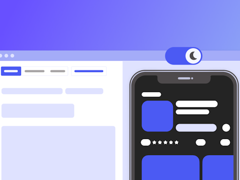
Read this blog to understand how and why you should consider dark mode when designing your app’s creatives. Don’t forget to use AppTweak’s App Page Previewer to visualize your store page in dark mode, too!
Optimize your creatives for dark mode
When designing your app’s creatives, keep in mind that they should look as good in dark mode as in light mode. For example, you should use contrasting colors in both modes – typically, you want your app icon to stand out from both a white or black background.
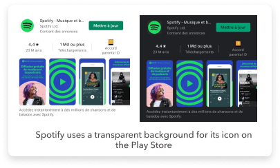
Another great tip for Android is to use a transparent background in the app icon so that it adapts to the user’s preferred mode.
Before submitting your app to the store, you can use our App Page Previewer (App Store) or Store Listing Previewer (Google Play) to check how your creatives will look in both light and dark mode. You can even upload several different icons and screenshots to test which version looks best in both modes.
Test and visualize new metadata & creatives with our App Page Previewer
Best practices to optimize your app creatives in dark mode
Users mainly use dark mode on their phones because they say that it is easier on the eyes, especially when checking phones in bed or late in the evening. If your app is regularly used by users during late hours, you should be particularly careful to avoid bright colors that could be aggressive on the eyes for users in dark mode. We found a couple of examples that put forward some best practices when optimizing your creatives in dark mode.
Avoid white phones in app screenshots
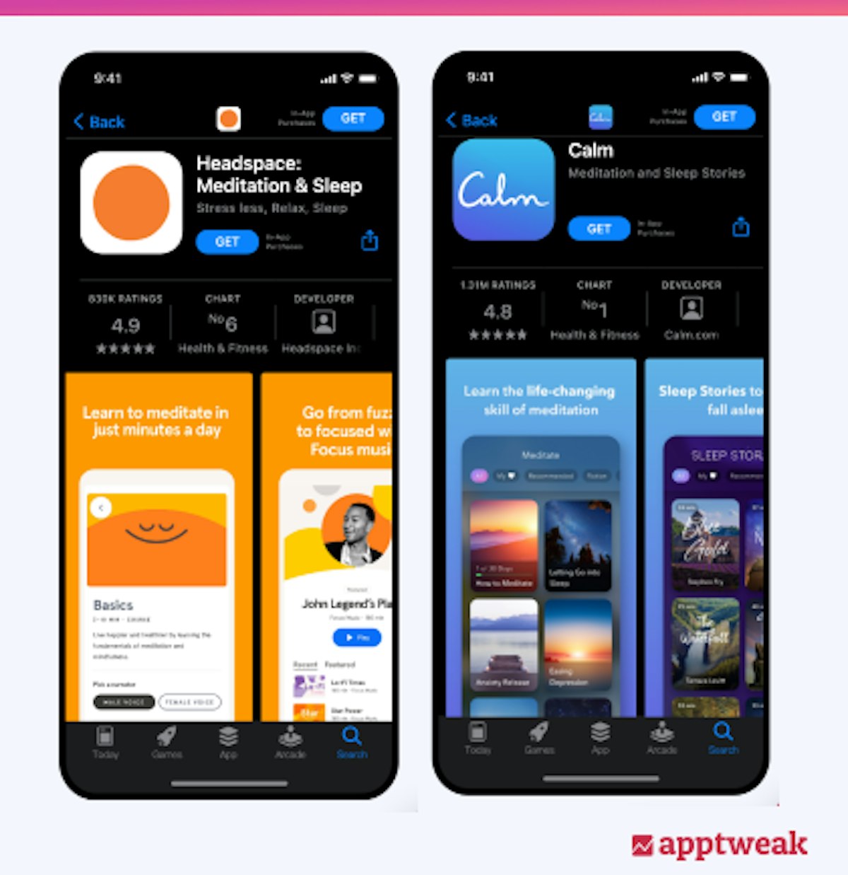
In the example above, Headspace’s screenshots are particularly bright in dark mode. This is mainly because the phones used in the app’s screenshots are white. Calm, however, did a great job of featuring a phone with neutral colors that work just as well in light mode as in dark mode.
Avoid white backgrounds
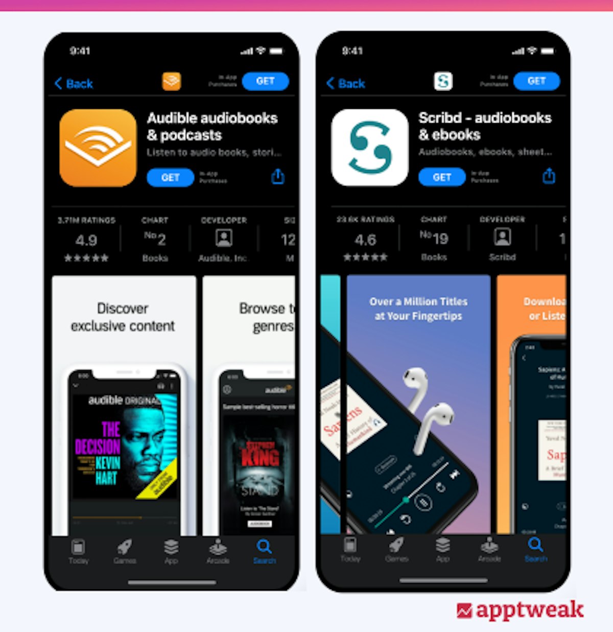
White backgrounds should be avoided in screenshots, since they stand out particularly aggressively for users in dark mode. Scribd did a good job of using bright background colors in its screenshots, while still making them pleasant to look at in dark mode.
Make sure effects work in both dark & light modes
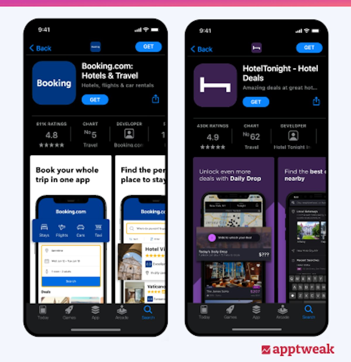
The screenshots for Booking.com look very nice in light mode. The white background makes it look as if there wasn’t any background at all. This helps users focus on the main element featured in the screenshots – the phone. However, when in dark mode, the screenshots appear extremely bright which can be uncomfortable for the user. In general, we recommend favoring darker backgrounds since they blend in better with dark mode, while contrasting nicely with light mode.
Follow these tips, guidelines, and best practices for app creatives on the App Store and Google Play
TLDR
- Dark mode has become increasingly popular on phones
- Users generally opt for dark mode because it is easier on the eyes
- It’s important to consider dark mode when optimizing your app’s creatives. Avoid using bright contrasts that can be uncomfortable for users in dark mode
- Test and preview your creatives in light and dark mode using our App Page Previewer
Related posts
 AppTweak ReleasesReviews and Ratings
February 28, 2024
Learn about how the App Reviews Manager can help you scale your app store reputation.
 AppTweak ReleasesCompany Announcements
February 22, 2024
In 2014, AppTweak began as one of the first ASO tools. Fast forward 10 years, and we’re the first choice …
 AppTweak ReleasesSearch Ads
February 5, 2024
Apple Search Ads (ASA) is a powerful tool for app marketers and UA managers to connect with new users on …
 AppTweak ReleasesSearch Ads
January 18, 2024
Learn about AppTweak’s Search Ads Manager, a complete tool to create, manage, and scale ASA campaigns by uniting ASO & …
 AppTweak Releases
December 18, 2023
AppTweak’s yearly product recap – a non-exhaustive overview of our favorite releases for mobile marketers, all launched in 2023.
 AppTweak Releases
November 14, 2023
Grow your ASO knowledge with ASO with AppTweak course & certification.
 Georgia Shepherd
 Oriane Ineza