
开始探索我们全新的热门排行榜界面
 作者 Flavien Eyer
Product Manager at AppTweak
— 1 分钟阅读
几个月前,我们发布了全新的热门排行榜界面,以实现更多的自定义。即使这个新功能非常适合比较不同的图表,但我们注意到仍然有更多的功能空间!由于有时您只想了解其他国家/地区的情况,因此我们改进了界面,以实现更大的灵活性和更好的用户体验。这篇博客将向您展示新的界面,并再次强调热门排行榜在您的分析中的重要性。
尝试探索模式
我们最近在热门排行榜功能中增加了一个部分,该页面允许您快速地从一个排行榜切换到另一个排行榜。此部分旨在提供更大的灵活性,并快速获得对不同国家/地区的 insights。
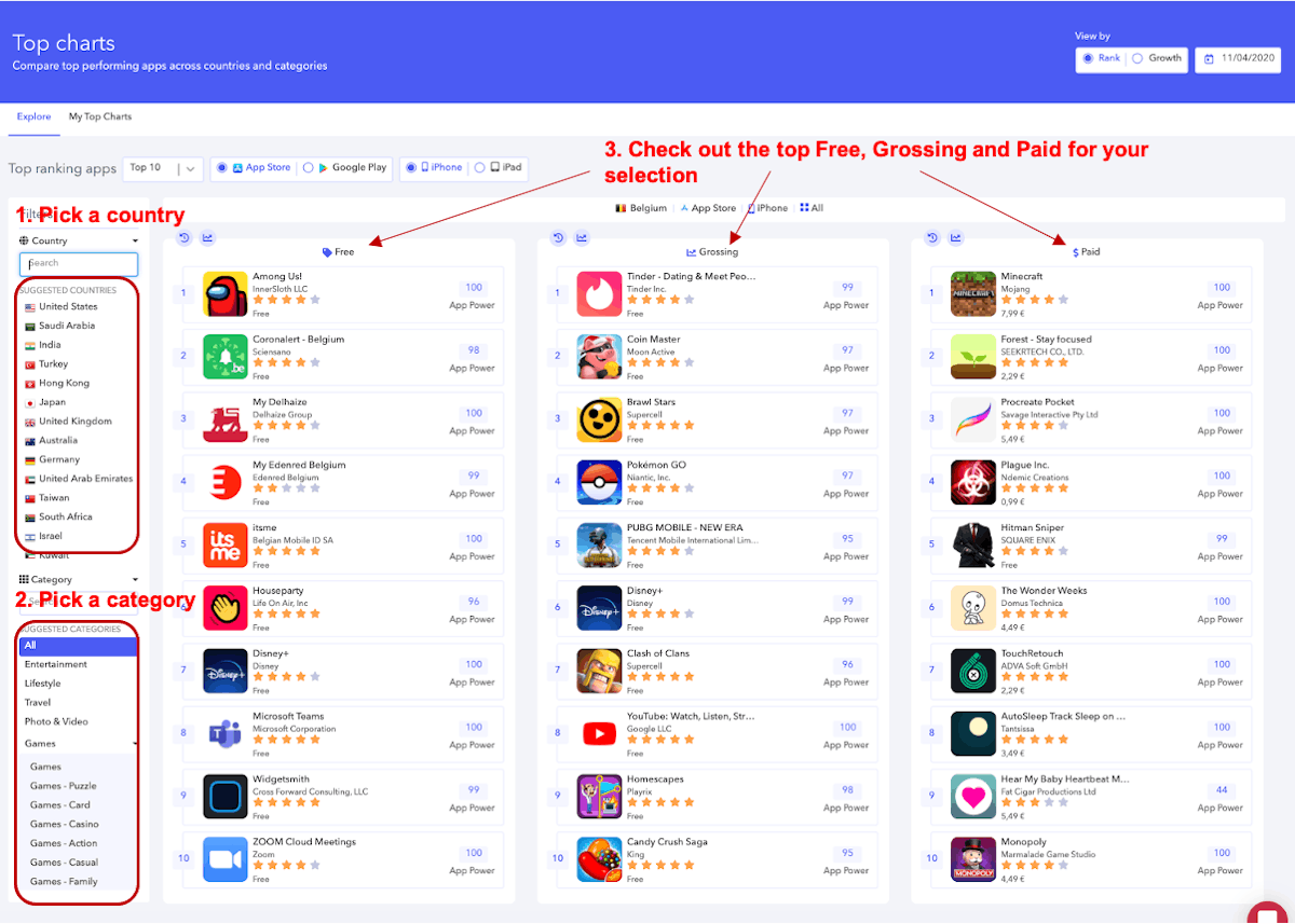
这个新的设计允许您从一个热门排行榜转到另一个热门排行榜,并一键轻松更改分析的国家/地区或类别。
此界面将根据您关注的 apps 显示建议的类别和国家/地区列表。例如,您可能在许多不同的类别和国家/地区关注许多不同的 apps,我们的新界面将自动建议您关注最多 apps 的国家/地区和类别,以便您获得量身定制的体验。
当然,通过这个新的界面,您仍然可以跳转到更加个性化的部分,即“我的热门排行榜”:
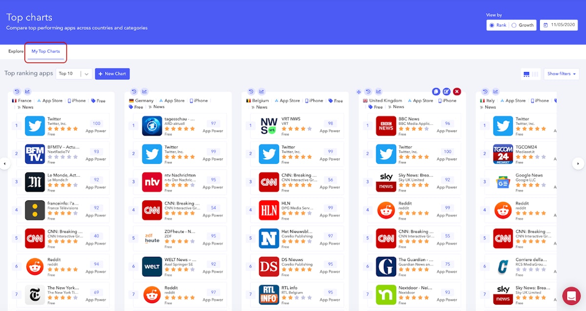
提醒一下,此部分将允许您保存最多 9 个您选择的热门排行榜。当您想要同时监控多个图表,而无需从一个排行榜切换到另一个排行榜以全面了解情况时,此视图特别有用。
现在您对我们的新结构有了更好的了解,我们可以回顾一下您可以使用此界面提供的所有功能从此部分获得的一些主要好处!
充分利用此界面
- 识别竞争对手并了解背景
通过查看热门排行榜,您可能会在特定的国家/地区获得一些有价值的 insights。有价值的信息将使您了解您的 app 在什么样的背景下发展。
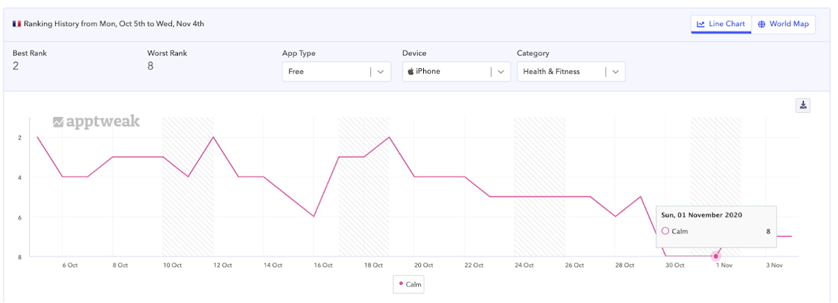
让我们以法国的 app Calm 为例。在过去的一周里,Calm 一直在热门位置排名。但是,当我们查看最近的排名时,我们观察到其排名略有下降。这可能来自几个原因,但也许通过查看此类别中的热门 apps,我们可以更好地了解当前的趋势。
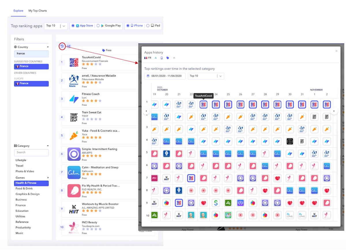
当我们查看 apps 历史记录视图时,我们看到这段时间与国有 app TousAntiCovid(一个 covid 追踪 app)的崛起有关。因此,在 10 月 28 日即将宣布新的封锁法规后,此 app 达到了第一的位置。此外,我们看到健身 apps 也在获得热门位置,这可能表明法国的趋势不利于冥想 apps,而更有利于健身 apps。这种新的封锁似乎使法国人想要在家做更多的运动,而不是冥想。
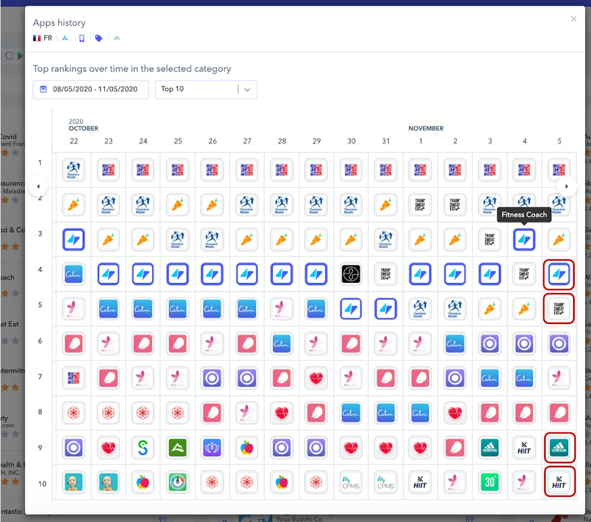
现在我们可以看到前 10 名中有 4 个不同的健身 apps(Adidas Runtastic、Workouts by Muscle Booster、Train Sweat Eat 和 Fitness Coach),而 2 周前只有一个。
因此,Calm 应该意识到热门排行榜中可见的这些背景变化,以便调整其策略。
- 可视化趋势并保存您最好的热门排行榜
您可以从此界面获得的另一个有价值的 insight 是分析多个国家/地区的趋势。如果您想了解您的 app 在各个国家/地区的表现,以及是否有共同的竞争对手可能正在窃取您的下载量,这一点至关重要。
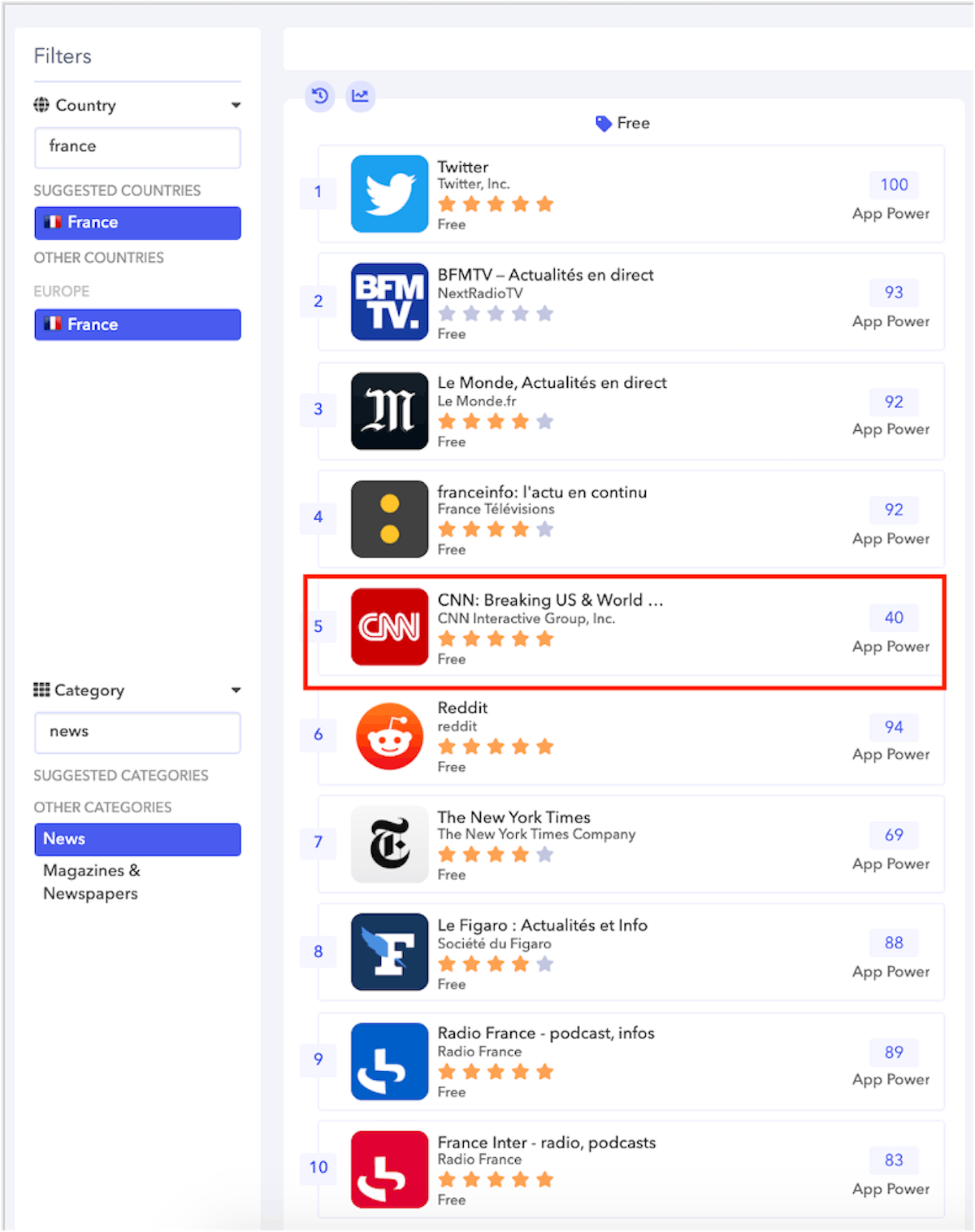
例如,在这里,您可以看到随着美国大选,app CNN 在 11 月 3 日在法国成为趋势:
您可能想知道这种情况是否发生在多个欧洲国家/地区。为此,您可以决定使用“我的热门排行榜”部分中的交叉热门排行榜视图:
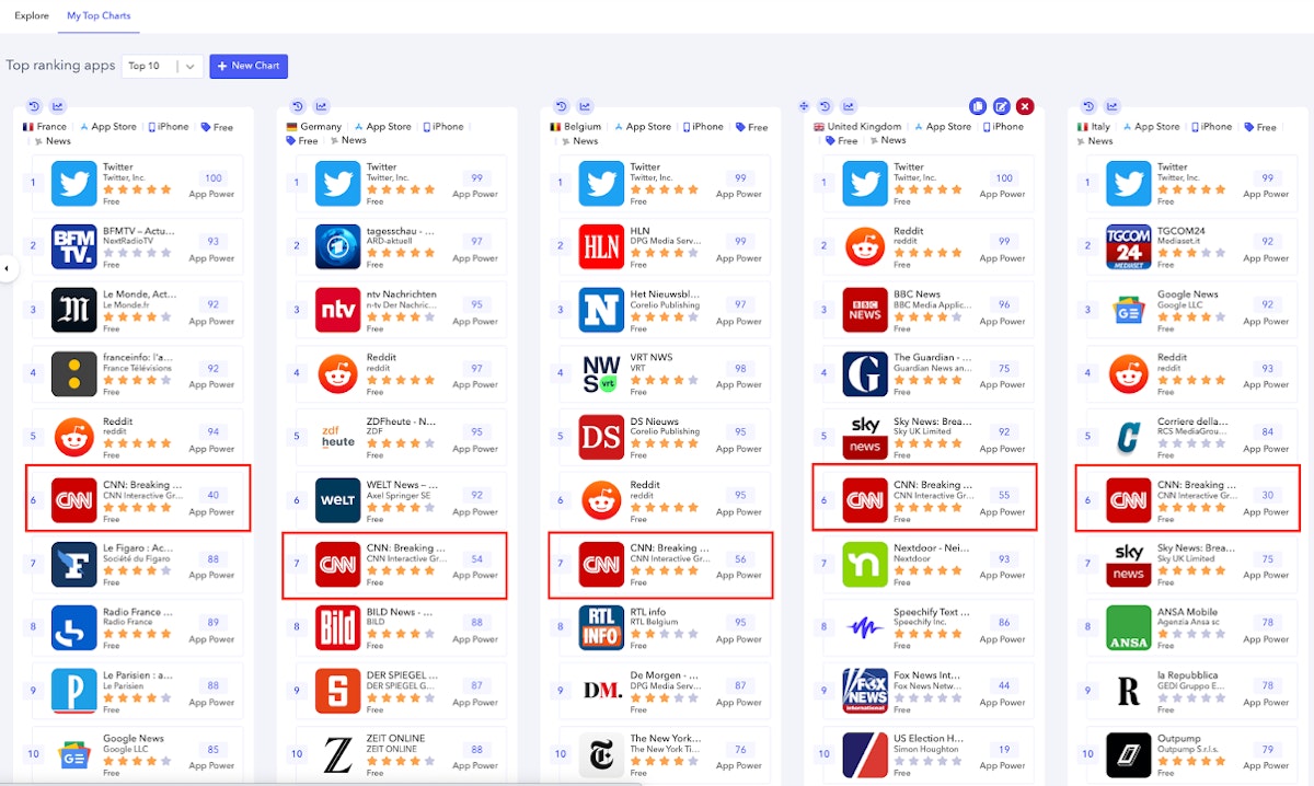
如上面的屏幕截图所示,您可以快速发现 app CNN 正在达到热门位置。这可以在德国、比利时、英国、意大利或法国等多个国家/地区看到。
例如,当您查看法国的排名历史图表时,这一点甚至更加明显:
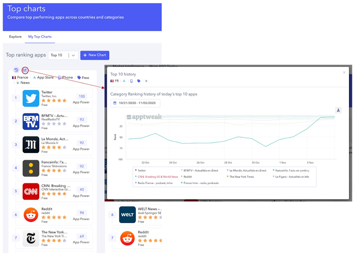
该 app 在 11 月 4 日从第 50 名上升到第 5 名。非常明显的是,在此期间,此 app CNN 是一个局外人,只要美国大选正在进行中,它可能会一直保持在热门位置。
立即享受我们的新界面!
总而言之,我们在热门排行榜功能中添加了一个新部分,以便在您想要探索多个图表时提供更好的用户体验。此外,您仍然可以享受“我的热门排行榜”部分,以监控与您的分析最相关的热门排行榜,并对情况进行更好的交叉视图分析。不要忘记您可以从这些热门排行榜中获得的所有 insights,以下是一个简短的列表,仅举几例:
- 识别未来的竞争对手
- 识别每个国家/地区的特性
- 加深您对特定国家/地区的了解
- 对您的热门排行榜进行跨国家/地区分析
- 寻找潜在的 apps 进行投资
转到更多 ASO 工具部分中的热门排行榜功能,发现您自己的 insights!

更多产品更新相关文章

 Micah Motta

 Georgia Shepherd
