App Screenshot, Icon, Video Size Guidelines for iOS & Android
 by Georgia Shepherd
Product Marketing Manager at AppTweak
— 18 min read
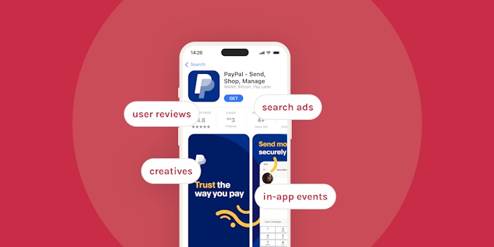
On both the App Store and Google Play, visual assets are a critical part of App Store Optimization (ASO). Given that the average user spends a maximum of 7 seconds on a single app store listing, it is essential to immediately attract your target market’s attention. Doing so (and doing it better than your competition) could be a game-changer in driving downloads for your app.
Learn how to optimize your app store product page with our practical ASO guide
Many of our customers raise questions such as:
- What size and format should my screenshot and icons be on the App Store and/or Google Play?
- How should I alter my screenshots, icons, or videos for different Apple/Google devices?
- What guidelines should I follow to optimize my app icon, screenshots, videos, and feature graphic?
In this blog, we will answer these questions and more. Read on to discover size and format guidelines for visuals on both the App Store and Google Play, as well as handy tips to optimize your app’s visual assets.
Last updated in 2023.
Tips & best practices for app screenshots
Your app screenshots are one of the most essential elements of ASO – they are often the first contact a potential user will have with your application. Screenshots should:
- Reflect the essence of your app
- Display its most interesting features
- Demonstrate your app’s core functionality
If your screenshots are not visually optimized, you are creating an opportunity for your competition! If they are unattractive, your app may come across as unappealing. Do not create over-detailed screenshots as that can make your app difficult to use. As a result, your target market is more likely to consider a competitor’s app with similar features but better visuals.
Screenshot image orientation
You will need to choose the best image orientation for your screenshots. On the one hand, portrait images will present your users with a wide range of content, without needing to scroll to see more. Conversely, landscape screenshots will allow you to concentrate more intensely on one distinct message.
On the App Store and Google Play, screenshots must demonstrate real in-app or in-game experiences. You should highlight your app’s core features and content, so users get a realistic idea of the app experience. As such, you should not include captured footage. For example, a picture of a user holding a phone to play your game – in your screenshots.
As a general rule of thumb, your screenshots should be:
- Representative of actual app/game use
- Relevant to your brand
- Reflective of the value your app will bring to users
- Aesthetically pleasing
- Localized (to the market and language)
- Evergreen (universally and continually relevant)
Screenshots sizes & guidelines on the App Store
Keep these tips and App Store guidelines in mind while designing the best screenshots for your app/game:
- Apple allows a minimum of 1 and a maximum of 10 screenshots for each supported device. We recommend using all 10 screenshot spaces to fully optimize this opportunity to exhibit your app.
- Screenshots must be in either PNG or JPEG format. Apple provides comprehensive pixel size specifications for screenshots on iPhones, iPads, Macs, Apple TVs and Apple Watches (see table below).
- Prepare images for each medium to enhance your visibility across as many devices as possible. Your app will display correctly on various devices, showcasing its appearance on the user’s current device.
- According to Apple guidelines, images taken directly from an app’s user interface (UI) must be the focus of your screenshots on the App Store. While every screenshot should serve a distinct purpose, most of your attention should be directed towards the first 1-3 images displayed (depending on the image orientation, only the first 1-3 will be presented in search results and the majority of users will not scroll to see the rest). If your app supports it, Apple also recommends including a screenshot in Dark Mode to demonstrate the in-app appearance of this feature.
Check out the table below for screenshot size requirements for each specific iOS device:
| Device | Portrait dimension | Landscape dimension |
|---|---|---|
| 6.7 inch (iPhone 14 Pro Max) | 1290 x 2796 pixels | 2796 x 1290 pixels |
| 6.5 inch (iPhone 14 PlusiPhone 13 Pro Max, iPhone 12 Pro Max, iPhone 11 Pro Max, iPhone 11, iPhone XS Max, iPhone XR) | 1284 x 2778 pixels; 1242 x 2688 pixels | 2778 x 1284 pixels; 2688 x 1242 pixels |
| 6.1 inch (iPhone 14 Pro) | 1179 x 2556 pixels | 1179 x 2556 pixels |
| 5.8 inch (iPhone 14, iPhone 13 Pro, iPhone 13, iPhone 13 mini, iPhone 12 Pro, iPhone 12, iPhone 12 mini, iPhone 11 Pro, iPhone XS, iPhone X) | 1170 x 2532 pixels; 1125 x 2436 pixels; 1080 x 2340 | 2532 x 1170 pixels; 2436 x 1125 pixels; 2340 x 1080 pixels |
| 5.5 inch (iPhone 8 Plus, iPhone 7 Plus, iPhone 6s Plus) | 1242 x 2208 pixels | 2208 x 1242 pixels |
| 4.7 inch iPhone SE (3rd generation, 2nd generation), iPhone 8, iPhone 7, iPhone 6s, iPhone 6 | 750 x 1334 pixels | 1334 x 750 pixels |
| 4 inch iPhone SE (1st generation) | 640 x 1096 pixels (without status bar), 640 x 1136 pixels (with status bar) | 1136 x 600 pixels (without status bar), 1136 x 640 pixels (with status bar) |
| 3.5 inch (iPhone 4s) | 640 x 920 pixels (without status bar), 640 x 960 pixels (with status bar) | 960 x 600 pixels (without status bar), 960 x 640 pixels (with status bar) |
| 12.9 inch iPad Pro (6th generation, 5th generation, 4th generation, 3rd generation) | 2048 x 2732 pixels | 2732 x 2048 pixels |
| 11 inch iPad Pro (4th generation, 3rd generation) iPad (10th generation) iPad Air (5th generation, 4th generation) iPad mini (6th generation) | 1488 x 2266 pixels; 1668 x 2388 pixels; 1640 x 2360 pixels | 2266 x 1488 pixels; 2388 x 1668 pixels; 360 x 1640 pixels |
| 10.5 inch iPad (9th generation, 8th generation, 7th generation), iPad Pro, iPad Air | 1668 x 2224 pixels | 2224 x 1668 pixels |
| 9.7 inch, iPad, iPad mini | 1536 x 2008 pixels (portrait without status bar); 1536 x 2048 pixels (portrait with status bar); 768 x 1004 pixels (portrait without status bar); 768 x 1024 pixels (portrait with status bar) | 2048 x 1496 pixels (landscape without status bar); 2048 x 1536 pixels (landscape with status bar); 1024 x 748 pixels (landscape (without status bar); 1024 x 768 pixels (landscape with status bar) |
| Apple TV | 1920 x 1080 pixels; 3840 x 2160 pixels | |
| Mac | One of the following, with a 16:10 aspect ratio: 1280 x 800 pixels; 1440 x 900 pixels; 2560 x 1600 pixels; 2880 x 1800 pixels | |
| Apple Watch | One of the following: 410 x 502 pixels (Ultra); 396 x 484 pixels (Series 7, Series 8); 368 x 448 pixels (Series 6, Series 5, Series 4, and SE); 312 x 390 pixels (Series 3) |
Screenshots sizes & guidelines on Google Play
According to Google, screenshots should convey your app’s capabilities, the look and feel, and the experience of your app to potential users for better app discovery.
- On the Play Store, Google allows a minimum of 4 and a maximum of 8 screenshots in JPEG or 24-bit PNG (no alpha) for each supported device. Your screenshots must have a minimum dimension of 320 pixels and a maximum of 3840 pixels.
- Google allows up to 8 screenshots for each supported device type. Supported device types include phones, tablets (7-inch and 10-inch), Android TVs, and Wear OS watches.
| Device | Screenshots | Size | Ratio |
|---|---|---|---|
| Android Phone | Minimum 4, maximum 8 | Between 320 pixels and 3840 pixels | Landscape 16:9; portrait 9:16 |
| Chromebook and tablets | Minimum 4, maximum 8 | Between 1080 and 7680 pixels | Landscape 16:9; portrait 9:16 |
| Wear OS | Maximum 8 | Minimum size of 384 x 384 pixels | 1:1 |
| Wear OS watches | Maximum 8 | Minimum size of 384 x 384 pixels | 1:1 |
| Android TV | Maximum 8 |
- Google’s guidelines also require that your screenshots’ maximum dimension should be no longer than double the minimum dimension.
- Screenshots can be displayed throughout the Play Store – in search and on the homepage, in addition to your store listing on Google Play.
- Some sections of Google Play show groups of recommended apps and games in a large format using screenshots. To be eligible for recommendations in configurations that use screenshots, the following guidelines are a requirement.
- For apps, you must provide at least four screenshots with a minimum 1080px resolution. These should be 16:9 for landscape (minimum 1920x1080px) screenshots and 9:16 for portrait screenshots (minimum 1080x1920px).
- For games, you must provide at least three 16:9 landscape screenshots (minimum 1920x1080px) or three 9:16 portrait screenshots (minimum 1080x1920px).
Expert Tip
To appear among recommended apps and games, apps should demonstrate the in-app experience, focusing on the core features and content. Games, on the other hand, should depict in-game experience, so users can get a sense of what the gameplay will be like if they download and play.Finally, Google recommends avoiding:
- Content that reflects or suggests Google Play performance, ranking, promotional information, testimonials, or prices such as “best”, “discount”, “ top”, “#1”, “sale”
- Calls-to-action such as “download now”, “play now”
- Text in small font sizes or backgrounds that compete with the text, as they will not be visible on many phone screens
- Time-sensitive content that might quickly become outdated to reduce the need to frequently update
Taglines in screenshots on Google Play are only permitted if necessary to convey the key characteristics of the app or game and should not represent over 20% of the image.
Become an expert in screenshot optimization with our 8 handy tips
Tips & best practices for app icon
Your app icon is another vital ASO element.
Sure, your icon is the smallest visual you need to consider, but it will consistently be associated with your app!
Your app icon appears throughout the store, so you should dedicate enough thought to producing the best possible icon to represent your app.
To produce a great icon, you should first identify the root objective of your app – what is the fundamental purpose of its existence? Then determine the most straightforward way to communicate this to your specific target audience. We recommend:
- Having a singular focal point (no photos or screenshots) so as not to overwhelm your market
- Focus on a simple graphic, only including words if they are essential in communicating your message
- If your target audience is familiar with your brand, incorporate this in your icon to increase the recognition and credibility of your app
- A/B test your app icon to understand how your market responds to different visual combinations.
Expert Tip
As a general rule of thumb, your app icon should be simple, memorable, and recognizable.Keep these valuable tips in mind to make your app icon stand out from the competition
App icon sizes & guidelines on the App Store
Apple encourages developers to remove any unnecessary features in an icon to maintain visual consistency regardless of size. On Apple devices, following these guidelines is particularly important, as the sticky header feature implies that your icon remains visible on your App Store listing, even if users scroll down (so you’ll want to get this right).
- Regarding the content, Apple recommends not to add too many details, because they can be hard to discern and can make an icon appear muddy, especially at smaller sizes. Your icon should only include textual elements only when it’s an essential part of your experience or brand. Text in icons is often too small to read easily, which can make an icon appear cluttered.
- On the App Store, your icon should be a high-resolution image in PNG format. Apple provides a list of size specifications you should follow to produce a customized icon for the different devices your app will be available on:
| Device | Icon dimensions |
|---|---|
| iPhone | 120 x 120 px @2x; 180 x 180 px @3x |
| iPadPro | 167 x 167 @2x |
| IPad | 152 x 152 px @2x |
| iPad mini | 152 x 152 px @2x |
| App Store | 1024 x 1024 px |
App icon sizes & guidelines on Google Play
You need an app icon to publish your store listing. The app icon will be shown in various locations on the Play Store, including your store listing, search results, and top charts.
- On Google Play, your icon will also need to be a high-resolution image, in 32-bit PNG (with alpha). The dimensions must be 512px by 512px, with a maximum file size of 1024KB.
- For illustrated and/or minimalistic artwork, Google recommends using the whole asset space, so the piece occupies the entire icon. If you want to incorporate a more complicated logo or artwork, Google recommends restricting the principle image to a freeform design piece placed within a keyline grid in the center of the icon (instead of forcing the logo/artwork to full bleed).
Expert Tip
You should avoid any transparent background colors (they will display the background color of the Google Play UI instead), and also avoid any embedded badges for promotions (e.g. “sale now on”) or branding.- Your icon design should be a full square without shadow, as Google dynamically applies the rounded shape and shadow for consistency purposes (demonstrated in the image below). It is also important to consider that the resulting radius will equal 20% of your icon size.
Google recommends using the whole space for illustrations and to restrict more complicated images to a keyline grid. Source: developer.android.com
Google prohibits text or graphic elements that:
- Mislead users such as a message indicator when there are no new messages and download symbols when the app is not related to downloading content
- Suggest or indicate ranking
- Promote deals or incentivize installs
- Indicate participation in a Play program
Tips & best practices for app preview/promo videos
Videos can be valuable components of your app store listing, allowing you to provide an in-depth preview of what users can expect if they download your app. On both the App Store and the Play Store, video previews are particularly recommended for games.
Incorporating a video into your app listing can offer more “real” insight into your content and features than the icon or screenshots, and can support users’ decision-making processes. A user who has downloaded your app is less likely to be disappointed if they had been informed by a truly representative video. This means that, on the whole, people will be less likely to uninstall the app after downloading.
As a general rule of thumb, your app preview videos should be:
- Representative of real app/game use
- Timeless (no time-sensitive content)
- Localized (to the market and language)
Expert Tip
You should conduct A/B tests on video variations to gain insight into what works best for your audience.Discover the average app conversion rates per category on the App Store and Google Play
App preview sizes & guidelines on the App Store
Videos on the App Store are referred to as app previews. They can be displayed both on the search results page and directly on your app listing. If your app preview orientation is portrait, it will be displayed first in the search results, before your screenshots.
- You can have up to 3 app previews for each language your app supports. Each preview can be up to 30 seconds long, with a maximum file size of 500MB. App previews autoplay, with the sound muted by default. Apple recommends using copy to give context to the footage.
- App previews must only present real footage made within your app. So it would be against guidelines to film someone using the app on a phone. For instance, promotional content is forbidden, alongside anything inappropriate or illegal (e.g. copyrighted music). Footage in app previews should demonstrate the features, functionality, and user interface of your app.
- Apple recommends utilizing your first app preview to tell a cohesive story that guides users through the same experience the app provides. As the app previews autoplay, you should aim to spark your audience’s attention as soon as possible, and highlight exactly why your app is unique. For the second or third previews, we recommend demonstrating any special features or interesting content not already mentioned.
Check out the table below for app preview size requirements for each specific device:
| Device size or platform | Portrait Dimensions | Landscape Dimensions |
|---|---|---|
| 6.5 inch (iPhone 13 Pro Max, iPhone 12 Pro Max, iPhone 11 Pro Max, iPhone 11, iPhone XS Max, iPhone XR) | 886 x 1920 pixels | 1920 x 886 pixels |
| 5.8 inch Super Retina Display (iPhone 13 Pro, iPhone 13, iPhone 13 mini, iPhone 12 Pro, iPhone 12, iPhone 12 mini, iPhone 11 Pro, iPhone XS, iPhone X) | 886 x 1920 pixels | 1920 x 886 pixels |
| 5.5 inch (iPhone 8 Plus, iPhone 7 Plus, iPhone 6s Plus) | 1080 x 1920 pixels | 1920 x 1080 pixels |
| 4.7 inch iPhone SE (3rd generation, 2nd generation), iPhone 8, iPhone 7, iPhone 6s, iPhone 6 | 750 x 1334 pixels | 1334 x 750 pixels |
| 4 inch iPhone SE (1st generation) | 1080 x 1920 pixels | 1920 x 1080 pixels |
| 12.9 inch (iPad Pro (4th generation, 3rd generation)) | 1200 x 1600 pixels | 1600 x 1200 pixels |
| 12.9 inch (iPad Pro (2nd generation)) | 1200 x 1600 pixels | 1600 x 1200 pixels |
| 900 x 1200 pixels | 1200 x 900 pixels | |
| 11 inch iPad Pro, iPad Air (5th generation, 4th generation), iPad mini (6th generation) | 1200 x 1600 pixels | 1600 x 1200 pixels |
| 10.5 inch iPad (9th generation, 8th generation, 7th generation) iPad Pro, iPad Air | 1200 x 1600 pixels | 1600 x 1200 pixels |
| 9.7 inch (iPad, iPad mini) | 900 x 1200 pixels | 1200 x 900 pixels |
| Device size or platform | Video Dimensions |
|---|---|
| Apple TV | 1920 x 1080 pixels |
| Mac | 1920 x 1080 pixels |
App preview sizes & guidelines on Google Play
On Google Play, videos are called preview videos. Their aim is to promote your app and compel potential users to download it.
Your preview video appears before your screenshots on your app’s store listing. But for branded terms, preview videos display on the search page, home page, and your store listing.
On Google devices, preview videos always open full screen in landscape (so you will need to prepare your video in landscape!).
- Preview videos may or may not autoplay, depending on the user’s connection, settings, device and surface area. If they autoplay, videos play with muted sound and only show the first 30 seconds. Whenever your video doesn’t autoplay, a play button is overlaid on your feature graphic.
- There are no length restrictions on the Play Store, but we still recommend keeping your preview video as short as possible and including only essential content (~30 seconds). Preview videos appear before screenshots, so ensure adding any core information features at the beginning.
- As preview videos on Google Play autoplay on mute, you can use copy to provide users with further context. When doing so, continue to respect the following guidelines (as enforced throughout Play Store policies):
~ Do not include content that reflects or suggests store performance, ranking, accolades or awards, user testimonials, or price and promotional information”. For example, do not add words like “best,” “#1,” “top,” “new,” “discount,” “sale,” or “million downloads” in your video.
~ Avoid adding calls-to-action to your preview video, such as “download now”, “install now”, “play now”, or “try now”.
- In terms of content, Google recommends including minimal branding or storytelling in your preview videos. As in your Android screenshots, you should focus on the real in-app or in-game experience, and demonstrate your app’s core features within the first 10 seconds of the video.
- Google also recommends aiming for at least 80% of your preview video to be representative of the user experience by limiting title screens, logos, cutscenes, or other pre-rendered/promotional content. Do not include people interacting with their device. For example, a clip of a user’s fingers playing your game in your video.
Expert Tip
To add a preview video to your store listing, enter your YouTube URL into the “preview video” field. Also ensure you disable ads in your video by deactivating any monetization.Feature graphic sizes & guidelines on Google Play
Feature graphics can be a very powerful tool in engaging your target market, and are shown alongside your icon and app name throughout the store. If you have a promo video, the feature graphic will also display as its cover image.
Feature graphics will also appear if your app and game gets featured among collections of apps or recommended games. Feature graphics should be in JPEG or 24-bit PNG (no alpha) format, with dimensions of 1024px by 500px.
- Keep your feature graphic informative, localized (to the market and language), and timeless (no time-sensitive content).
- Google recommends focusing your feature graphic on the essence of your app/game and highlighting the core value proposition, relevant context, or story-telling elements.
- Keep any focal points towards the center of the graphic; try to keep any prominent visuals out of cutoff zones (15% away from all 4 edges).
- Use vibrant colors to stand out from the Play Store background. Avoid the inclusion of taglines, pricing, or promotional content (you are more likely to be promoted if you follow these guidelines).
- Respect the Play Store policies that forbid content reflecting store performance (e.g., “best,” “top,” or “new”) or calls-to-action (e.g. “download now”).
Conclusion
Deciding how exactly to optimize the visual assets on your app store listing can definitely be a complicated process. Hopefully, your ASO goals seem much more attainable, thanks to our tips and guidelines.
To produce the most efficient screenshots, icons, videos, and feature graphics, it is fundamental to identify your app’s core value. Producing the optimal visuals for your listing will be much easier if you start by asking the following questions:
- What root purpose does my app serve? To entertain? To inspire? To inform?
- How can I represent my app’s purpose in a simple, straightforward way?
- Who is my target market? What are their needs and expectations?
- Visually, what is my competition doing? How can I divert my target market’s attention to my app?
Finally, be sure to use the correct sizes and resolutions for your images according to the devices your app supports. Specifically, considering each device as its own unique medium (and tailoring your visuals to each) could particularly resonate with your audience, increase your app’s clickthrough rate and drive your downloads, which is the ultimate goal.
Related posts
 Advanced ASO
April 24, 2024
Discover ASO best practices to for your app and game creatives.
 Advanced ASOApp Market Insights
February 15, 2024
Understand how mobile marketers can maximize their impact by leveraging the app stores as a true marketing channel.
 Advanced ASOApp Market InsightsArtificial Intelligence (AI)
January 11, 2024
Discover the interesting trends already at play in ASO that are worth keeping an eye on in 2024.
 Advanced ASO
December 11, 2023
Dive deeper into the creatives trends among the top casual mobile games on the app stores.
 Advanced ASO
October 6, 2023
Discover how to prepare your app to leverage the potential of Black Friday.
 Advanced ASOApp Market InsightsGuest Insights
August 16, 2023
Discover how aligning ASO and paid user acquisition can help boost your app’s CVR.
 Anthony Ansuncion
 Sukanya Sur
 Simon Thillay
 Justin Duckers
 Marcos Barceló