
Mobile App Icon Trends by App Store Categories
Whether you’re in the process of launching a new app or fine-tuning an existing one, paying attention to the intricate details of your app icon can make all the difference. The app icon serves as the first impression for potential users, and its optimization plays a crucial role in influencing your conversion rate.
In this blog, we’ll analyze the app icons of various app categories and examine the nuances that set successful icons apart. Whether it’s the simplicity of design, color choices, or unique elements, each detail contributes to the overall appeal. Behind every popular app icon lies a journey of iterations and rigorous testing, which provides valuable insights that can elevate your own icon design.
Insights from top 50 app icons in various categories
We took a close look at the top 50 apps in different store categories on the App Store and Google Play, namely Shopping, Social, Travel, Finance, Food & Drink, and Games. We have summarized the key creative points for these top 50 apps per category and are excited to pass on our insights.
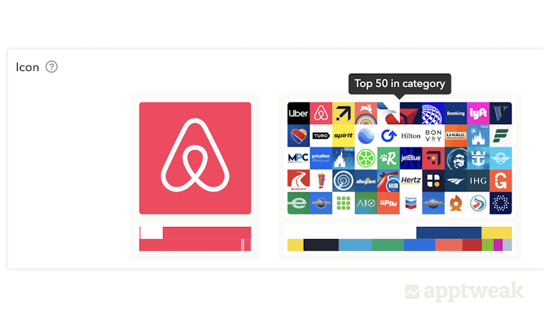
AppTweak analyzes the top 500 apps in each category on the App Store and Google Play to determine the current metadata trends. With Metadata Benchmarks feature, you can view the top 50 icons in each category and get a quick overview of the main colors and elements used.
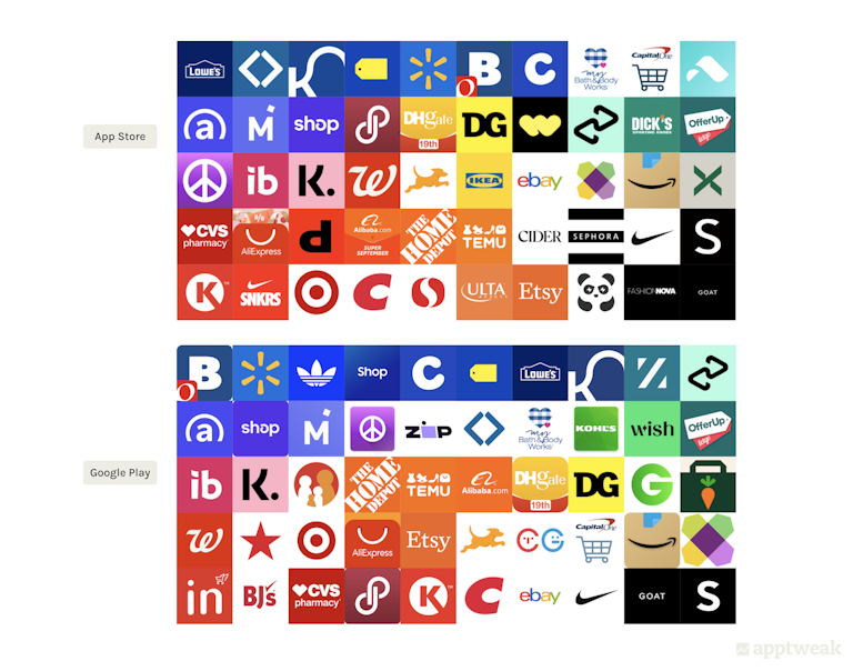
Shopping category app icon trends
App Store vs Google Play
Follow these expert tips to make your app icon stand out from the competition
| Elements | Key Trends |
|---|---|
| Main colors | 36 – 38% use warm colors (red and orange) as their primary color. Other colors used vary depending on the brand color, but blue is the next most prominent |
| Style | Solid backgrounds with flat logo layered on top. Few gradients or layers, and most use only two colors |
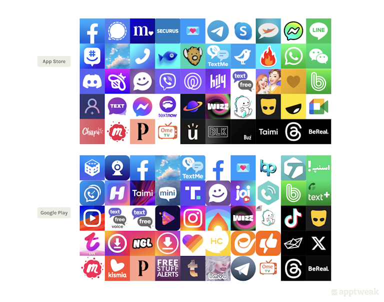
Social category app icon trends
App Store vs Google Play
| Elements | Key Trends |
|---|---|
| Main colors | Most icons contain blue and/or purple. Also, 12 – 16% have primarily black logos. Some utilize multiple colors for their icon |
| Style | 30 – 36% of icons use a gradient in their design, many with more than one color. 18 – 36% use a communication-focused element in their icon (chat bubble, phone, etc.), and this is much more prominent on the App Store |
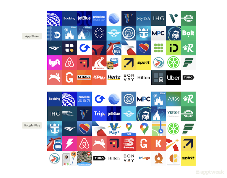
Travel category app icon trends
App Store vs Google Play
| Elements | Key Trends |
|---|---|
| Main colors | Around 40 – 45% of icons use primarily blue About 25 – 35% use a white background |
| Style | Mostly solid backgrounds with a logo layered on top, but with some variation 3D imagery used to make logos pop out About 26 – 28% display a travel-related element in their icon (plane, globe, map, etc.) |
Finance category app icon trends
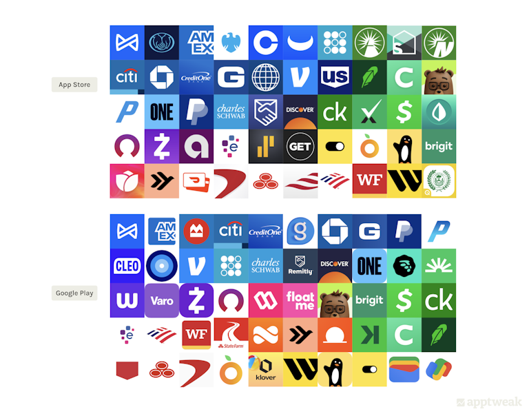
App Store vs Google Play
| Elements | Key Trends |
|---|---|
| Main colors | Around 40% use blue as a primary color in their icon Green is the next most prominent color |
| Style | Mostly solid background colors with a flat logo layered on top Most are simple logos, probably to portray professionalism and a serious impression |
Food & Drinks category app icon trends
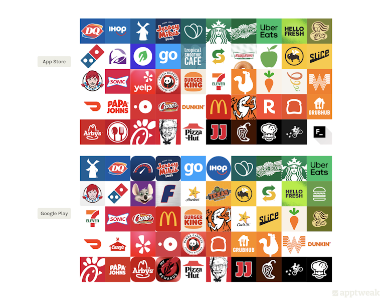
App Store vs Google Play
| Elements | Key Trends |
|---|---|
| Main colors | 46 – 54% use red somewhere in their icon, while many use red as the primary color in their icon |
| Style | 24 – 28% show something food-related in their icon Designs vary with many keeping their icon flat and few including gradients, 3D elements, or layers |
Conclusion
The icons of leading apps mirror trends within their respective categories. Hence, it becomes crucial to benchmark your app category’s trends when crafting or updating your app icon.
However, if you’re launching a new app, there’s an opportunity to set yourself apart from the competition by creating something different. Finding the ideal balance between uniqueness and sticking to best practices and current trends is key.
For deeper insights into app icons, delve into the extensive features offered in our ASO Report. Uncover additional strategies to enhance your app’s visibility and overall success!


 Sukanya Sur

 Oriane Ineza

 Anthony Ansuncion
