
Your app icon is the first thing people see, and sometimes, the only thing they judge. In this blog, we’ll guide you through practical tips to help you design an app icon that grabs attention and drives installs.
Key takeaways
- A strong app icon can significantly increase your app’s click-through rate and installs.
- Icons should communicate a single, clear idea at any size.
- Color choice and contrast play a major role in visibility and differentiation.
- Consistency with your app’s UI and brand identity builds user trust.
- Avoid text, especially if it clutters the design or doesn’t scale well.
- Logos work best when your brand is already widely recognized.
- Seasonal updates and localization are easy ways to boost re-engagement and market fit.
- Studying your competitors allows you to identify category and market trends and break them.
- A/B testing icon variations is one of the most effective ways to optimize performance.
- Your icon should reflect the app’s in-product experience and resonate with your target audience.
Why app icons are important
Your app icon is your app’s first impression. It’s what users see before reading a description, checking reviews, or watching a promo video.
It’s the one piece of branding that appears everywhere, from the store and search results to the home screen. And because it’s small and visual, the design has to do a lot of heavy lifting in a tiny space.
The role of app icons in user engagement
A strong app icon directly impacts click-through rates (CTR). On both the App Store and Google Play, a user’s first interaction is often just a glance, and your icon will either spark curiosity or get your app skipped. A visually striking, well-crafted app store icon design will make store visitors more likely to tap, explore your app’s page, and eventually install it.
In competitive niches like gaming, lifestyle, or entertainment, even a few percentage points of difference in CTR can translate into thousands of installs per day. So, if your icon doesn’t engage, the rest of your store page might never be seen. This is why a weak icon effectively undermines your entire acquisition funnel.
Impact of app icons on brand recognition and visibility
Your app icon is your app brand in its most distilled form. Over time, users will associate the icon with your app’s value and experience. Familiarity inspires trust. When someone scrolls past your app on their home screen, you want that shape and color to instantly resonate.
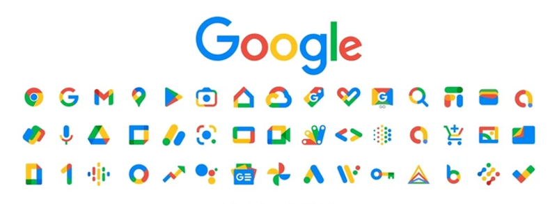
For brands with multiple apps like Google, icons work together as a visual system. For smaller publishers and indie apps, a standout icon can be your brand’s most powerful identifier. Either way, nailing your app icon is non-negotiable.
Fundamental principles of app store icon design
App icons aren’t just tiny logos. They’re functional visual assets that need to work across multiple sizes, backgrounds, and lighting conditions. A good icon design balances aesthetics, usability, and adaptability.
Simplicity and clarity
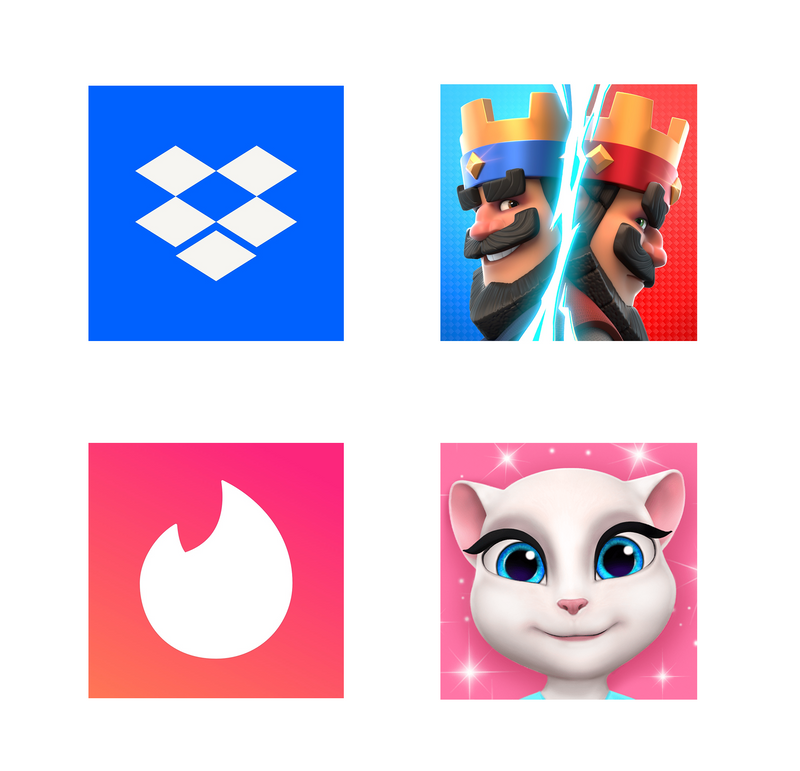
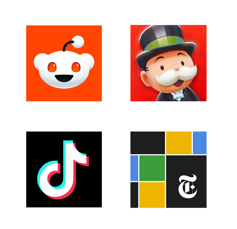
The best app icons communicate one idea. Simple, focused compositions stand out more in crowded search results and maintain their integrity at small sizes. Complex illustrations, cluttered compositions, or overloaded details get lost, especially at small sizes. Whether it’s a single shape (Spotify), symbol (TikTok), or object (Camera+), the key is clarity.
Expert Tip
To keep things clear, avoid cluttered layouts and excessive shading or gradients unless the platform supports it. The more minimal and confident your concept is, the more effective your icon will be.
Consistency with brand identity
An icon is the visual entry point to your app. If the tone, colors, or design language clash with your app’s UI, users will feel the dissonance. For instance, if your app’s UI uses soft gradients and pastel tones, don’t go for a neon icon, or use soft lines if your app is heavy on strong geometric shapes.
To ensure your app icon feels like an extension of the app and to maintain consistency, reuse brand colors or signature shapes where possible.
Scalability and versatility
Your icon must hold up at all sizes—from 1024x1024px in the store to 29x29px on a home screen or notification tray. That’s why scalability and versatility matter.
That means your design has to scale gracefully without losing legibility or emotional impact. Fine details and small text will disappear or look blurry, while overly complex layouts can turn into visual mush.
Expert Tip
If your icon doesn’t communicate its idea clearly at 60×60 pixels, it’s too complicated. Design with small sizes in mind from the start, and consider testing across multiple resolutions as you design.Color theory and psychology in app icons
Colors carry meaning and influence emotion. In the app stores, they also affect your app’s visibility, differentiation, and therefore conversion rate.
Color choice is one of the fastest ways to make your icon stand out or blend in. Store visitors make split-second judgments based on color and shape alone, so nailing this part can make or break your app icon design.
Choosing the right color palette
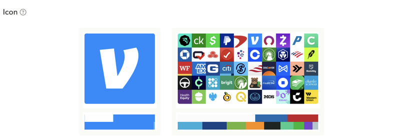
Your app icon’s colors should reflect both your brand personality and your app’s category. Blue often suggests trust and focus, so it’s popular in Finance and Productivity categories. Red creates urgency and energy, frequently used in the Lifestyle category.
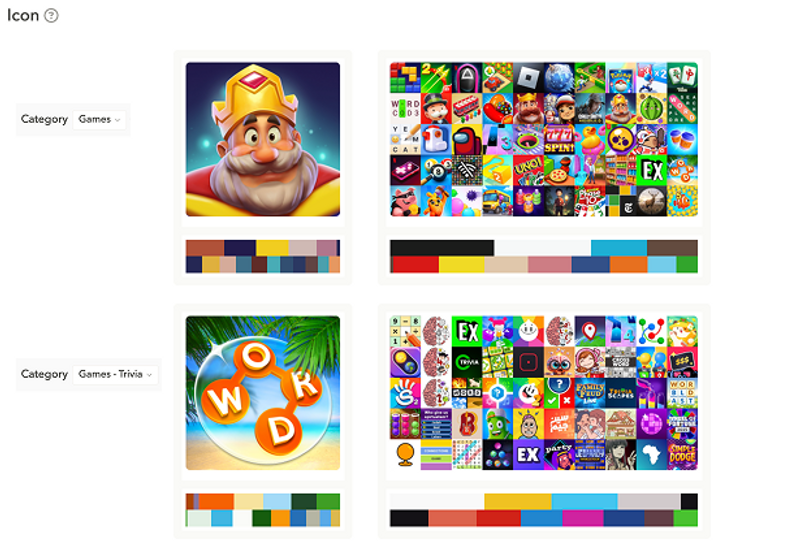
Most games create contrast with mainly white and black colors and small touches of other colors. Word and Trivia games are the exception, as they choose the most colorful palettes.
Considering your competitors’ color schemes can help you build your app icon. If everyone in your niche uses orange, then a bold purple might give your app a visibility edge. Alternatively, your audience might still resonate best with orange. That is why you should A/B test your app icon.
Expert Tip
Competitors might already have run tests that you’re considering running. Save yourself time and money with AppTweak’s ASO Timeline feature and see which A/B tests your competitors have run or are currently running.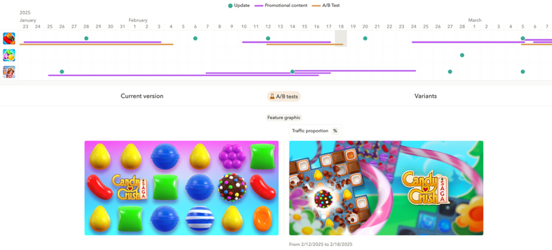 Candy Crush A/B testing a feature graphic on the US Google Play Store in AppTweak’s Timeline
 Utilizing contrast for visibility
The contrast between your icon’s elements and the background is not just for style, but for function. Icons need to be legible against various backgrounds, including light and dark themes. That means clear differentiation between foreground and background elements, strong edge definition, and high enough contrast to maintain readability.
On Android, a transparent background helps the icon integrate into various UI environments more naturally. On iOS, your app icon may appear on system-added backgrounds in places like Spotlight or widgets, so make sure your icon stands out in both light and dark modes.

The App Page Preview feature allows you to test metadata changes on a real phone before making any changes in your store console. Our tool lets you see exactly what users will see. This way, you can be sure your metadata looks as intended, before anything goes live.
App icon design tips and best practices
Follow these best practices from top-performing apps to design your icon.
Tip 1: Keep your app icon simple
People might not understand your app icon if it contains too many elements or shows multiple features. To avoid confusion or failure to communicate what your app is about, your app icon should be clear and simple to understand.
A single concept like a camera lens, a shopping cart, or a musical note is almost always more effective than a complex visual narrative.
Discover mobile games icon trends
Tip 2: Clearly communicate the purpose of your app icon
A well-designed app icon gives users a very obvious clue about what the app does. For example, a plant ID app might use a stylized leaf or magnifying glass to signal discovery and nature.
When you look at your app, ask yourself: “Is my app’s purpose evident from the icon”? This is especially important in search results, where people are absentmindedly scrolling through apps before deciding to tap.

Tip 3: Align your icon with in-app experience and audience expectations
Your app icon should visually reflect your brand, but even more so, the experience users will find inside. If your app is colorful and animated, a hyper-minimalist icon would feel out of place. If it’s a meditation app, a chaotic, saturated design might attract attention but send the wrong signal, confusing your target audience.
A productivity app for professionals might benefit from sleek, structured design cues, while a kids’ game can lean into color, character, and playfulness.
Tip 4: Leverage your brand color with purpose
Take the time to think about how to make your icon stand out in the search results. Bright colors can attract attention, but too many can overwhelm.
Choose one or two dominant colors that align with your brand and category. Contrasting elements, eye-catching palettes, and clarity over style are key.
One way to choose the colors for your app icon is to reflect on your brand colors. For example, Netflix has a very simple app icon, which consists of its logo on a black background. The unembellished icon clues the user in as to the in-app’s UI (user interface), letting users expect mainly red and black colors in-app.

Remember, any color or color palette you choose should be legible in both light and dark mode.
Tip 5: Avoid using too much text
Remember that icons are not banners. Moreover, text gets pixelated at small sizes, doesn’t localize well, and often feels redundant since the app name is displayed next to it. The only exception is when the text is iconic, part of a strong brand like the “F” in Facebook or the “t” in Tumblr.
Tip 6: Logos work only if your brand is strong
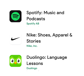
If you’re Spotify or Nike, your logo is your icon.
But if your brand isn’t widely recognized, using a logo as your icon might not communicate anything to the user. Consider using a metaphor, concept, or a simplified version of your logo that better conveys your app’s value.

Tip 7: Embrace seasonal updates
Changing your app icon for holidays or events shows users you’re active and paying attention. It can also create urgency and increase re-engagement. The best seasonal icons are subtle. They tweak colors or add visual small elements (like snowflakes or Santa hats) while keeping the core design intact.
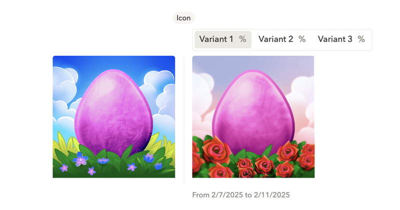
Using the AppTweak ASO Timeline feature, we found out that Lily’s Garden updated their icon for Spring, but key elements of the game—the main character in this case—remained at the center of the design.

Tip 8: Localize your icon for key markets
Different cultures respond to different visuals. What feels playful in one country might seem childish in another. For apps expanding internationally, localizing your icon—or at least testing variants—can improve conversion. Supersolid, for instance, saw higher performance in Brazil after A/B testing icons that better aligned with local user preferences.

Supersolid conducted a market analysis to update Home Street’s seasonal icon to better reflect its audience. To identify best practices for Home Street’s icon, Supersolid used AppTweak to compare the creatives of the top 10 apps on both app stores.
Tip 9: Research your competition (then differentiate)
Before designing anything, search your target keywords and look at your competitors. Find common trends…and then break them! If most icons are flat and monochrome, try a layered look. If everyone uses white backgrounds, go bold.
Leverage AppTweak’s ASO Creatives Explorer to catch in one view app icons from different competing categories, uncover best practices, and find new app icon trends.

Tip 10: A/B test everything
This might be the most important tip. App icons are one of the easiest variables to test, and one of the most impactful. Use Google Play store listing experiments or Apple’s product page optimization feature to trial different versions. AppTweak’s creative testing tools can help you uncover trends and get inspiration from market leaders. Even subtle tweaks in expression, color, or composition can lead to double-digit improvements in conversion.
Changing your app icon can lead to big results. AppQuantum, a mobile game publisher, updated its client’s mobile game icon, driving installs by 21.5%.
How AppQuantum increased downloads by 21.5% with creative A/B testing
Platform-specific design guidelines
App stores have strict formatting and style rules for icons. By not abiding by them, you risk your app being rejected or not appearing with the best quality:
- Apple requires square assets with rounded corners applied by the system.
- Google Play requires full-bleed 512x512px icons with no shadows or corner radii (the Play Store adds these dynamically).
- visionOS and tvOS support layered icons for depth and animation.
- watchOS uses circular icons exclusively.
You’ll also need dark and tinted variants for iOS and visionOS, and potentially different versions optimized for specific devices or regions.
In September 2025, Apple released iOS 26 with the Liquid Glass design system. This is Apple’s biggest UI upgrade since iOS 7, and represents a major shift in how your app shows up across Apple devices. Here are some tips from our designers to update your app icon for Liquid Glass:
- Design in layers: Liquid Glass brings blur, depth, light refraction, and motion. Remember that light, dark, tinted, and mono modes can change how your icon appears. Test for all.
- Think cross-device: One .icon file now adapts to iPhone, iPad, Watch, Mac, Apple TV, and Vision Pro. Your icon has to shine at every size.
- Use Icon Composer: Apple’s new tool lets you build reactive, layered icons. Note that you’ll need to ship a new build, not just replace an asset.
Read our blog for a detailed breakdown of specific app icon requirements for each platform.
Common mistakes to avoid in app store icon design
Mistakes in app store design can negatively impact visibility, user engagement, and conversions. Here are the most common pitfalls in app store icon design, and how you can avoid them:
Mistake #1: Overcrowding with details
Including too many elements in your app icon creates visual clutter, making it difficult for users to quickly understand your app’s purpose. Icons with excessive detail often appear unclear, especially at smaller sizes, which negatively impacts user engagement and conversions. Aim for simplicity and prioritize key visual metaphors.
Mistake #2: Not enough visual contrast
Poor color contrast makes your app icon hard to notice among competitors or difficult to distinguish in different viewing modes (light vs. dark). Strong visual contrast is essential for visibility and quick recognition. Always test your icon design in both light and dark modes to ensure optimal visibility.
Our App Page Preview lets to see metadata changes on a real phone before making any changes in your store console.

Mistake #3: Ignoring platform-specific guidelines
Each platform has unique icon guidelines regarding dimensions, shape, transparency, and style. Ignoring these guidelines can lead to rejection during the review process or suboptimal visibility on the app store. Always follow the official guidelines provided by platforms like Apple and Google to ensure your icon appears correctly and professionally.
Mistake #4: Using non-associative icon designs
An app icon should quickly convey the primary functionality of your app. If your icon design is abstract or not connected to your app’s purpose, users may struggle to understand its value proposition. An app icon that fails to communicate your app’s purpose can hurt recognition and CTR.
Mistake #5: Failing to differentiate from competitors
Designing icons that are too similar to those of your competitors can reduce your visibility and brand recognition. Your icon should clearly differentiate your app and highlight its unique value proposition. Research competitor icons regularly and focus on creating distinctive visual identities.

Mistake #6: Poor readability or use of excessive text
Excessive or small-sized text in icons decreases readability, especially on smaller device screens. This negatively impacts clarity and reduces immediate user comprehension. Limit or entirely avoid text in your icons, using visual symbols instead to convey your app’s message.
Mistake #7: Lack of scalability testing
A common oversight is not testing how your icon appears across different sizes and resolutions. An icon might look perfect at high resolutions but can become illegible or blurry when scaled down. Test your icon at various sizes to ensure it remains clear and visually appealing across all devices and contexts.
Mistake #8: Ignoring localization opportunities
Using the same icon design globally without considering cultural nuances can limit your app’s appeal in certain markets. Localized icons often resonate better with local audiences, increasing conversions and user engagement. Regularly analyze your performance in different markets and consider localized variants where necessary.

Mistake #9: Using misleading visual elements
Icons containing visual elements that misrepresent or exaggerate the app’s capabilities lead to user frustration and lower retention rates. Always ensure your icon accurately reflects the app’s actual functionalities, avoiding misleading imagery or promotional exaggeration.
Mistake #10: Ignoring regular updates and optimization
Failing to regularly refresh or optimize your app icon for current trends, seasonal events, or significant app updates can make your app appear outdated or less relevant compared to competitors who actively update their visuals. Regular A/B testing and seasonal refreshes ensure your app stays visually engaging and aligned with user expectations.
App icon testing and optimization strategies
Just like every element of your app metadata, icon design isn’t one-and-done. You should implement a routine of regular testing, iterating, and, if necessary, adapting your icon based on performance data and audience feedback.
A/B testing for app store icons
A/B testing lets you compare different icon versions in a controlled environment. An effective A/B test should help you determine which icon variants perform best based on real user interactions.
Before launching your tests, you need to select user segments that will see the tests. Start with your primary user demographics or segment tests based on location, age, sex, device, etc., for even more specific insights.
Begin by testing one variable at a time, from the icon background color, prominent elements, any text, etc. Testing one variable at once will help you identify what resonates with your audience and the visual elements with the most impact on conversion rates or installs.
While you can perform these tests in the Play Console or App Store Connect, you can also leverage third-party tools to streamline and automate your testing, and check out your competitors’ A/B tests in AppTweak.
A/B/B testing is a technique that helps improve test reliability by flagging false positive results. In an A/B/B test, you test two variations against your current icon. This is particularly effective because it ensures you don’t lose existing performance while testing alternatives.
Learn more about A/B/B tests and improving A/B test reliability
Gathering user feedback
Ask your users what they think. Run informal polls on social media or collect opinions in user interviews. If users can’t tell what your icon represents or confuse it with another app, take that into consideration.
Using our App Reviews Manager Tool, you centralize and analyze all your app store reviews— across countries, languages, and platforms—in one intuitive dashboard.
You can filter reviews by topic, tag feedback automatically, and even generate AI-powered summaries to spot recurring complaints or feature requests:

User reviews can be a mine of information! Reviews are filled with user frustrations, bugs, and feature requests, but they can also understand what users like and dislike about your app, and share insights on what better aligns with your app and resonates with them.
Whether it’s frustration about a recent change or confusion over what the icon even means, reviews often reveal how users truly feel and what visual changes are working (or failing):

Internal testing can also be valuable. Display different icon options to your team and ask what each version suggests. If there’s no consensus or people interpret it differently, the design may be too abstract.
Event-based icon updates
While in-app events or promotional content can be a powerful tool for showcasing new content or offers related to time-limited events, you shouldn’t underestimate the impact your app icon can have during seasonality.
While icons aren’t often updated to reflect seasonal changes, they can still make a big impact. Updating your icon can help you visually connect with users and signal that something new is happening in your app.
For seasonal updates to work, your icon needs to be minimalistic and clear so that, even with those additional elements, your icon still makes it impossible to understand.

The updated icon should feel like a variation, not a new design. Keep the core recognizable to preserve brand consistency.
Releasing holiday versions or aligning with in-app events can boost discoverability and increase engagement. It also signals to users that your app is active and maintained.
Conclusion
As the first impression users get of your app, your app icon is one of the most powerful levers in your ASO strategy. A good icon can increase installs, reinforce your brand, and elevate your visibility in crowded marketplaces. A bad one? It gets ignored.
Design your icon with purpose, test it regularly, and don’t be afraid to iterate. The smallest pixel can make the biggest difference.
FAQ
What makes a good app store icon?
A good icon clearly communicates app functionality, maintains simplicity, scales effectively across sizes, and aligns with brand identity. It should instantly convey your app’s essence without requiring additional context. A strong app icon also performs well across different backgrounds, lighting conditions, and device resolutions.
Does color choice impact app icon performance?
Yes, color significantly affects user perception and decision-making, influencing downloads and overall engagement. Bold, high-contrast colors tend to improve visibility in crowded app store environments. Additionally, thoughtful color choices can help set emotional expectations and create a stronger brand association.
Should my icon be the same as my company logo?
Only if your logo is widely recognizable. Otherwise, design a distinct icon that reflects your app’s purpose. Even if your logo is famous, adapting it slightly for app store contexts can make it more effective at small sizes and in dark mode.
Should I include text in my app icon?
Generally, avoid text unless absolutely necessary, as it reduces clarity, impacts scalability, and introduces localization issues. Text elements often become unreadable when the icon is resized for notifications or smaller screen displays. Instead, focus on creating a visual metaphor that transcends language barriers.
How often should I update my app icon design?
Regularly consider updates tied to seasonality or events, alongside continuous A/B testing for optimal engagement. Refreshing your icon periodically can signal to users that your app is actively maintained and evolving. At a minimum, review and optimize your app icon once a year to stay competitive.
What are the best tools for beginners to design an app icon?
Beginner-friendly tools include Canva, Figma, and Adobe Express. Each provides accessible interfaces and useful templates for designing effective icons. If you’re starting from scratch, these tools also offer built-in resources like color palettes, grids, and mockup previews to speed up the design process.
What dimensions should an app icon be?
Dimensions vary per platform. Refer to specific platform guidelines or our detailed app creatives guidelines blog for precise measurements and requirements. For example, iOS requires a 1024x1024px asset that gets automatically scaled down, while Google Play uses a 512x512px full-bleed format with rounded masks applied dynamically.
Designing an app icon can be difficult, but we hope that these tips and guidelines help you move forward with confidence! Don’t be afraid to step outside of your comfort zone and be creative with producing an app icon that truly resonates with your brand. We can’t wait to see the icons you create!


More articles in Start ASO

 Georgia Shepherd

 Oriane Ineza
