
App store screenshots, icons and video previews are often the first touchpoint with potential users. App store visuals are essential to the first impression your app makes as they capture user attention, communicate your brand’s core message, and showcase your app’s key features. In this guide, we’ll cover app store screenshot dimensions, app store icon size requirements, and powerful tools to help you A/B test, and pick optimal creatives for both the App Store and Google Play. We’ll also share tips and best practices to ensure your app listing stands out, engages users, and converts.
Bonus: Stick around to download our downloadable PDF guide–a side-by-side comparison of App Store vs Google Play creative guidelines, all in one place.
Key takeaways
- Follow platform rules: Each app store–Google Play and the App Store–has different specs for screenshots, icons, and videos. Always check the latest guidelines.
- First impressions matter: Focus on the first 3 screenshots–they’re the most visible and impactful.
- Design with intent: Highlight key features, include CTAs, and keep branding consistent across all assets.
- Rely on data and test everything: Use A/B testing tools to see what actually converts before going live.
- Localize smartly: Adapt visuals and text for each target market, not just through translation.
- Optimize metadata + visuals: Strong creatives work best when aligned with keyword strategy.
- Comply with platform-specific policies and guidelines: Use high-quality files in the right formats and stick to the submission rules to avoid rejection.
- Leverage video previews: Keep them short, engaging, and focused–videos can boost conversions.
What app store screenshot sizes and dimensions for iOS and Google Play?
When working on your app store listing, both app store screenshot sizes and app store screenshot dimensions matter for ASO and consequently for conversion. Here’s everything you need to know.
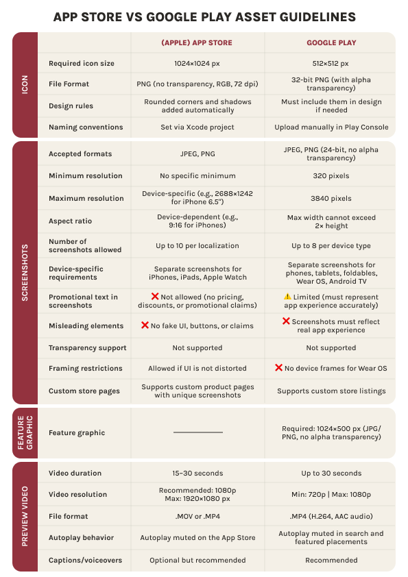
App screenshot size requirements (iOS vs Google Play)
Let’s look at app store screenshot size requirements: iOS vs Google Play.
| Platform | Number of screenshots | Screenshot dimensions | Aspect ratio | File type | Max file size | Color profile |
| iOS | 1–10 per localization | Varies by device | Varies (device-specific) | JPEG, PNG | 10 MB | RGB |
| Google Play | 2–8 per device type | Min 320 px, max 3840 px | The max dimension must not be more than twice the minimum dimension. 16:9 recommended | JPEG, PNG | 8 MB | RGB |
Note that since September 2024, Apple allows developers to upload screenshots for only one iPhone size and one iPad size. It will scale them down automatically for smaller ones.
Stay ahead of app store changes by reading ASO news and updates in AppTweak’s monthly digest.
Screenshot dimensions by device (iPhone, iPad, Android)
Below you can find the screenshot dimensions by device.
iOS devices (the App Store)
| Device | Recommended app screenshot size |
| iPhone 15 Pro Max | 1290 x 2796 |
| iPhone 14 / 13 / 12 Pro | 1170 x 2532 |
| iPhone SE (2nd/3rd gen) | 750 x 1334 |
| iPad Pro 12.9″ (6th gen) | 2048 x 2732 |
| iPad (10th gen) | 1640 x 2360 |
Android devices (Google Play)
| Device type | Min dimensions (px) | Max dimensions (px) | Aspect ratio |
| Android phone | 320 x 320 | 3840 x 3840 | 16:9 (opt.) |
| Android tablet | 320 x 320 | 3840 x 3840 | 16:9 (opt.) |
Side-by-side comparison: iOS vs Google Play app store screenshot dimensions
| Feature | iOS (the App Store) | Google Play |
| Screenshot count | 1–10 per device | 2–8 per device type |
| Accepted formats | JPEG, PNG | JPEG, PNG |
| Max file size | 10 MB | 8 MB |
| Min dimensions | Device-specific | 320 px (min width) |
| Max dimensions | Device-specific | 3840 px (max width or height) |
| Resolution | Must match device resolution | Flexible within min–max |
| Color profile | RGB | RGB |
| Auto-scaling supported? | Yes (upload for largest screen) | No (upload for each form factor) |
Tailor your app screenshots to each app store
To maximize impact, always adjust your app store screenshots to different app stores: customize the messaging, layout, and visual style for each. To find out what works best, resort to A/B testing. It’s one of the most reliable ways to optimize for higher conversions based on real user behavior.
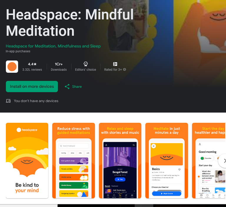
Headspace, a mindfulness and meditation app, uses different screenshots for the App Store and Google Play, tailored specifically to each platform. The audiences on iOS and Google Play often differ in behavior, expectations, and design preferences.

App store screenshot guidelines and submission rules
Optimizing app screenshots isn’t just about design, it’s about following platform-specific rules. Below is everything you need to know about app store screenshot guidelines for iOS (App Store) and Android (Google Play).
The number of app store screenshots
Both the App Store and Google Play have specific limits on the number of app screenshots you can upload. For iOS, you can include up to 10 screenshots per device type, such as iPhone, iPad, or Apple Watch, with at least one screenshot required for app submission.
On Google Play, you must upload a minimum of two screenshots and can include up to 8 per device type, including phone, tablet, TV, and Wear OS.
Why the first three screenshots matter most
The first three app screenshots on both platforms are crucial for making a strong first impression. These are often the only visuals users see in search results or featured placements, so they can make or break a potential download. Compelling, well-designed screenshots can be the deciding factor in whether someone taps to see your app store listing or scrolls past it.
Tip: To make a powerful first impression, showcase your app’s most important features, unique selling points, and key visuals or characters in the first three app store screenshots. Screenshot #1 should immediately communicate the core value of your app and/or include a clear call-to-action.
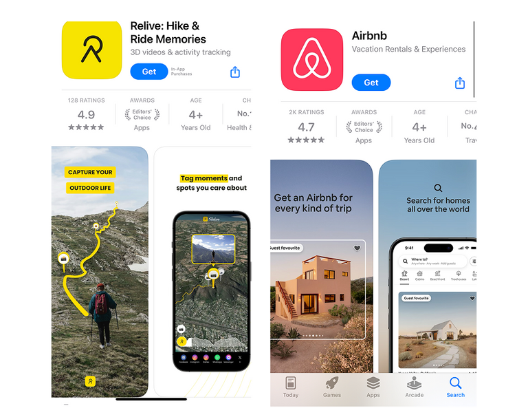
For example, these apps on the App Store and Google Play utilize action-first copy on each screenshot. Relive has “Capture your outdoor life” while Airbnb says “Search for homes all over the world” in their first screenshots. This is a smart move that not only highlights different features and user benefits at the same time, but also prompts users to explore the app and take action. Each of the following screenshots also guides users towards the app’s key benefits.
Sofascore, a sports app on Google Play, uses a similar strategy. Each app screenshot highlights a specific feature and value it offers to users. At the same time, each screenshot caption serves as a clear call-to-action.

Spotify and PictureThis, on the other hand, use the first screenshot to showcase the app’s core value and unique proposition. The second app screenshot then introduces a key feature along with a clear call-to-action.
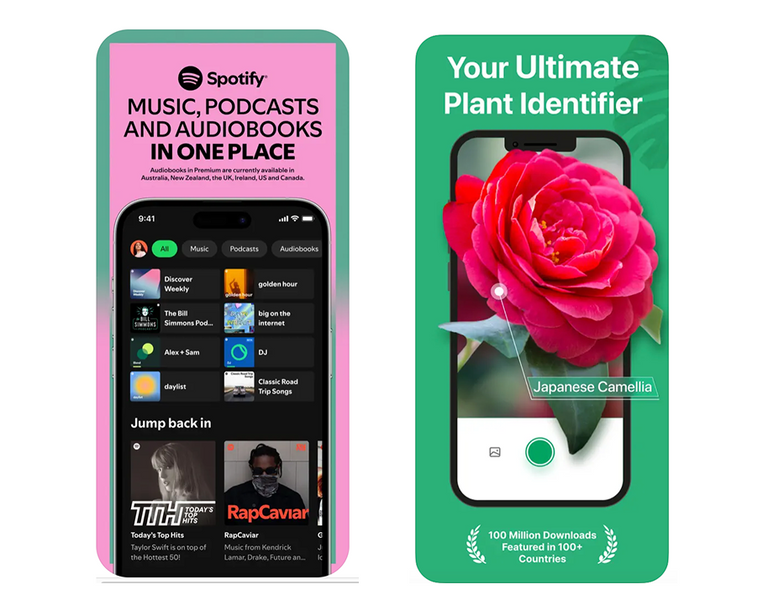
PictureThis uses a clever mix: it simultaneously communicates the app’s value proposition as a plant identifier, displays a plant with its name, and highlights an award (social proof). Despite all this, the screenshot remains uncluttered.
Tips to comply with Apple and Google’s promotional policies
To successfully promote your app on the App Store and Google Play, you need to comply with app store screenshot guidelines.
Both Apple and Google have strict guidelines to ensure that app store visuals are clear, truthful and aligned with their standards. Violating these rules can delay your app approval or even lead to rejection.
Here is Apple and Google’s compliance requirements for visual assets:
| Requirement | App Store | Google Play |
| No misleading content | Must reflect actual app experience | Must represent app accurately |
| No competitive claims | Avoid phrases like “Best app ever” | No unverifiable rankings like “#1 app” |
| Text guidelines | Keep overlay text minimal and clear | Avoid excessive text or slogans |
| Use of device frames | Optional but encouraged | Allowed but not required |
| Store branding (Apple / Google) use | Prohibited | Prohibited |
Here are some useful app store screenshot size and assets guidelines:
- The App Store Marketing Guidelines
- The App Store Screenshot Guidelines
- Google Play Promotional Policies
- Google Play best practices for your app store listing
Quick tips for your app store screenshots:
- Focus on authentic visuals from your app (no mockups with features you don’t offer yet).
- Avoid using Apple or Google branding, UI elements, or promotional phrases.
- Keep text minimal, easy to read, and localized for each target market.
App screenshot localization for the App Store and Google Play
Speaking of localization, app store screenshots are a powerful way to connect with global audiences and improve conversion rates in different markets. Both Apple and Google support uploading region-specific screenshots, allowing you to tailor visuals and copy for each locale.
Why localize app store screenshots on iOS and Google Play?
- Boosts trust and relevance for international users
- Reflects language, cultural specificities, and local context
- Enhances ASO performance
Check out AppTweak’s free ASO report to learn more about improving your app’s ASO performance.
Best practices for app store screenshot localization:
- Translate on-screen text and CTAs accurately.
- Keep the layout consistent across languages to maintain brand identity.
- Prioritize top-performing regions for localization efforts.
- Don’t just translate the text on your app screenshots–also adapt the visuals to match the cultural expectations and preferences of users in each target market.
Note: Apple requires separate uploads for each locale. Google Play allows localized screenshots per language in the Play Console.
Want to dive deeper? Read our guide to App Store localization.
What is the ideal app icon size for iOS and Google Play?
When designing your app icon, it’s essential to follow platform-specific app icon size guidelines. Along with the app screenshots, your app icon is one of the first elements users see. It should reflect your brand, be crisp, and compliant.
When it comes to app icon size guidelines, each platform has its own requirements:
iOS App Store icon size
The iOS app store icon size must meet Apple’s strict specifications:
- 1024 x 1024 pixels
- PNG format
- No transparency allowed
- RGB color space.
💡 Apple auto-generates scaled-down versions of this master icon for various devices and UI contexts.
Android app icon size (Google Play)
For Android, Google Play has its own app icon size requirements:
- 512 x 512 pixels
- 32-bit PNG
- No alpha (transparency)
- Max file size: 1 MB.
💡 Google Play also uses adaptive icons, which require separate foreground and background layers.
App store icon file format and background rules
The app store icon size is just one piece of the puzzle. To ensure your app icon renders correctly across devices and OS versions, follow these format and background rules:
- File format: Use PNG for both iOS and Android
- Color profile: Use RGB
- No transparency is allowed on either platform
- Background should be fully opaque and visually balanced: avoid white edges that blend into light store themes.
Tip: Design your icon to stand out on both light and dark backgrounds. This ensures your icon always looks great regardless of the mode users prefer.
Want more tips? You’ll find 10 essential ones for designing a mobile app icon right here.
Tips to improve conversions with app store screenshots and icons
Boost your app store performance with the following 12 proven strategies.
- Run A/B tests regularly
Continuously test different icon variations, screenshot designs, and CTAs to see what drives better results.
- Analyze competitors and top apps in your category
Learn from visual trends, messaging tactics, and positioning used by high-performing apps in your category.
Track what your competitors are doing with AppTweak.
3. Localize assets for top markets
Translate and culturally adjust your app screenshots and icons for each target market to connect with users more effectively by meeting their needs and expectations.
4. Include trust badges, awards, and other regalia
Showcase credibility at a glance with social proof like ratings, downloads, or recognitions.
5. Align visuals with seasonal or promotional campaigns
Refresh your visuals for holidays or seasonal events to grab the attention of users with high intent.
6. Optimize metadata alongside visuals
Pair your screenshots and icons with strong titles, subtitles, and keyword-optimized descriptions for full ASO impact.
7. Focus on the first three screenshots
They often appear in search results, so use them to highlight your app’s value, key features, and a clear CTA.
8. Design with thumbnail view in mind
Ensure text and visuals remain effective even when viewed at smaller sizes in search or featured lists.
9. Use consistent branding across visuals
Maintain a cohesive look with uniform fonts, colors, and layout styles to reinforce brand identity and user trust.
10. Highlight benefits over features
Convey the idea on how your app helps users with their goals and improves their lives, not just what it does. For games, also target the intent of the user: compete and win or just relax after work.
11. Leverage video previews (especially on the App Store)
A short, engaging app preview video can significantly boost conversion rates and give users a better sense of your app’s value.
12. Track performance with store analytics
Monitor user behavior and conversion metrics through tools like App Store Connect, Google Play Console, or AppTweak to inform continuous optimization.
Read our blog on app store screenshot best practices to get pro tips.
App preview videos: size, duration, and guidelines
App preview videos help potential users understand your app’s value at a glance. Below we share app store preview video guidelines and everything you need to know to make the most of videos on both the App Store and Google Play.
Video size, resolution, and duration
Let’s start with the video guidelines for the App Store.
The App Store:
- Max length: Up to 30 seconds per video, with a maximum of three videos allowed per app listing. Keep content focused and fast-paced.
- Resolution: Must be at least 1920 x 1080 pixels (full HD). Higher resolutions are accepted but should maintain aspect ratio.
- File size: Limit of 500 MB per video, so balance quality with compression.
Many mobile games utilize video instead of the first screenshot to showcase gameplay, UI and characters. The popular game Plants vs. Zombies leverages this trick too.

Google Play:
Max length: One video allowed, up to 30 seconds. Aim to hook the user within the first few seconds. Resolution: Minimum 1280 x 720 pixels (HD), but 1920 x 1080 pixels is recommended for better playback quality. File size: Keep it under 100 MB, especially since many users are on mobile data.
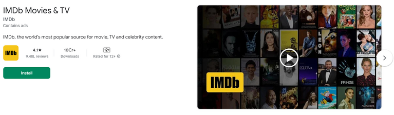
IMDb, a go-to source for movies and video content, also uses a video as their feature graphic–perfectly matching their app’s purpose.
Format: Both app stores support MP4 (H.264 video + AAC audio). Stick with standard encoding to avoid playback issues.
Autoplay behavior:
- The App Store: Videos autoplay on Wi-Fi only, and with muted audio. Ensure the visuals alone convey the message if users don’t hear sound.
- Google Play: Videos may autoplay in search results and on your listing, making the first few seconds critical to grabbing attention.
Submission tips and common pitfalls to avoid
Don’t submit your screenshots to the app stores without reviewing these common mistakes.
The App Store submission tips
Apple has more guidelines when it comes to what’s allowed in app preview videos. Follow these app store preview video guidelines and best practices to stay compliant and increase chances of approval:
- Only show actual in-app footage
Apple requires real, functional usage, so no stylized animations, promo-style content, or device mockups.
- Stick to UI recorded from the app build
Capture the video using a real iOS device or simulator. Don’t recreate the UI via any third-party tools.
- Avoid exaggerated marketing claims
Don’t include phrases like “#1 in the world” or “The best app”–Apple will likely reject them unless you can prove it.
- No pricing content or special offers
Refrain from saying “Free for a limited time” or showing discounts. Apple considers this a violation of store guidelines.
- Follow the correct device frame and orientation
Match the device you’re targeting, and don’t mix orientations (portrait vs. landscape) unless it’s intentional and approved.
Google Play submission tips
Google might be more flexible than Apple, but there are still important considerations for getting your video accepted and converting better:
- Host your video on YouTube
You’re required to use a YouTube URL for the video. Make sure it’s set to Public or Unlisted. Private videos won’t display in the store.
- Keep branding consistent
The video thumbnail and title on YouTube should match your app’s branding. Avoid clickbait titles or misleading visuals.
- Start strong: first five seconds matter most
Google often autoplays the video in the Play Store listing and search results,so make those first seconds count.
- Avoid “play store only” elements in the video
Don’t include Play Store UI in the video (e.g., install button, Google Play badges), as it may date the content or cause confusion across devices.
Common mistakes that can lead to video preview rejection
- Low resolution or quality: Blurry or pixelated content will get flagged or ignored.
- Non-functional content: Apple, in particular, will reject videos that don’t show the app’s actual use (e.g., stock video).
- Violating promotional rules: Avoid using exaggerated claims, misleading visuals, or unapproved calls to action.
Best practices and video preview tips for both the App Store and Google Play
- Check playback quality across devices before uploading, especially on older phones or tablets.
- Update your video with new major app features so it reflects the latest features and UI.
- Include voiceover: A professional voiceover can help guide viewers through your app’s functionality and benefits.
- Use captions: Voiceover is great, but keep in mind that many people watch videos on mute. So, always include on-screen text or captions.
- Avoid UI-heavy footage: Although we recommend demonstrating real UI in screenshots, beware of showing too much of it in the videos. Instead, demonstrate real-life usage scenarios to communicate value clearly.
- Use video analytics (via App Store Connect, Google Play Console, or YouTube) to measure engagement and optimize future edits.
Google Play feature graphic: size and best practices
The feature graphic is a key visual element of your Google Play store listing. While it’s no longer as prominent as it once was, it still plays a crucial role, especially if you’re using a video preview or getting featured.
Recommended size and format
- Dimensions: 1024 x 500 pixels
- Format: JPG or PNG
- File Size: Keep it under 1 MB
- No transparency allowed (solid background required)
Tip: Uploading a feature graphic is required if you include a promo video, as it becomes the video thumbnail.
Where the feature graphic appears
The feature graphic appears as the video thumbnail if you include a YouTube video in your app store listing on Google Play. It’s also displayed in featured placements like “Editor’s Choice” or “Featured Games”. Depending on the context, feature graphics may also appear on larger screens such as tablets, Chromebooks or TVs.
Google Play’s feature graphic design best practices
- Avoid text-heavy designs: Since it may be displayed in small sizes or overlaid by the video play button, keep the design bold and clean.
- Use vibrant colors and strong contrast to make the graphic stand out.
- Maintain branding consistency with your app icon, screenshots, and overall brand and visual style.
- Don’t include UI elements or device frames–this is meant to be promotional, not a product shot.
- Design it as a standalone piece that communicates the app’s category, vibe, or purpose right away.
How to ensure compliance and speed up app store approvals
Getting your app approved quickly and keeping it visible means following every requirement to the letter. Below are practical tips to help you streamline your submission process.
What to check before submitting your app store assets
Before publishing your app or submitting updated creatives, double-check the following essential elements.
First of all, app screenshot sizes must match required device resolutions for iOS (e.g. iPhone 6.7″, iPad 12.9″) and Android screen classes.
Secondly, make sure that your creative assets are named correctly and in accordance with the guidelines (e.g. no special characters, correct casing).
Then check your file formats. They should be correct for all types of your app store assets: screenshots in PNG or JPG; icons in PNG with no transparency, and videos in MP4.
Pay special attention to metadata—–title, subtitle, keywords—–and make sure it aligns with visuals and doesn’t include prohibited claims.
Last but not least: check your feature graphic on Google Play and videos on both stores and ensure they meet size and resolution requirements.
Align metadata with visuals for higher visibility
Don’t treat visuals and metadata as separate strategies, but rather make sure they reinforce one another:
- Use some keywords from your app title or subtitle within screenshots and captions.
- Esure visual storytelling reflects the core value propositions listed in your app description.
- Tie your icon, screenshots, and preview video to seasonal events or trends already mentioned in metadata for maximum ASO impact.
Tools to create and optimize app store assets
Creating standout app store assets isn’t just about creativity, it’s also about efficiency, consistency, and testing what works. The right tools can help you design, localize, and optimize creatives for your app store listing while staying compliant with App Store and Google Play’s requirements.
Screenshot generation tools
Create branded, high-converting screenshots quickly across devices and languages.
- Screenshot Builder: Drag-and-drop interface with device frames and pre-sized templates. Great for beginners.
- LaunchMatic: Automates screenshot generation across multiple screen sizes and languages.
- Fastlane Snapshot: A command-line tool to take localized screenshots automatically from your app using Xcode.
- AppLaunchpad: Offers screenshot templates and localization features with a visual editor.
- Canva: A flexible design tool for creating polished screenshots with text overlays, device frames, and templates—even if you’re not a designer.
💡 You may also utilize Canva to generate your app’s icon options.
Icon design tools
Generate a unique, creative and in-brand icon for your app with the following icon design tools.
- Adobe Illustrator / Photoshop: Universal tools for complete design control.
- Figma: Ideal for collaborative design and creating scalable vector-based icons.
- Sketch: A popular macOS design tool with plugins for app icon presets.
- MakeAppIcon: Upload one image and generate app icon sizes for all iOS and Android requirements.
A/B testing tools for visuals
To rely on data, rather than your inner gut and creative impulses, use A/B testing tools prior to selecting assets for your app store listing.
- AppTweak–Provides creative insights, competitive benchmarks, and localized A/B test ideas.
- Geeklab–Test different app store creatives (icons, screenshots, videos) before launch. Simulates real store environments and collects behavioral data to help you pick the best-performing assets.
- Google Play Store Listing Experiments–Native tool for running A/B tests directly in Google Play.
Download the ultimate app store assets guidelines
And now, just like we promised in the beginning, –here is your ultimate cheatsheet with the app store asset manual. Get the complete breakdown of app store screenshot guidelines, along with icon sizes, video preview specs, and feature graphic requirements for both the App Store and Google Play.
Download the PDF now and stay armed with the latest dimensions, formats, and best practices right at your fingertips.
Conclusion
The world of app store visuals is undeniably captivating, but it takes more than great design to stand out. To create effective assets–screenshots, icons, video previews, and feature graphics–you need to balance creativity with technical precision.
From mastering app store screenshot sizes to complying with submission requirements, every detail counts. Hopefully, this guide has helped you navigate the essentials and set you up for success on both the App Store and Google Play. You can bookmark this blog, and keep it close for every new launch or update.
FAQ
Here you will find answers to most burning questions about app store screenshot dimensions and app store icon sizes across iOS and Google Play.
How many app screenshots can I upload to the App Store?
You can upload up to 10 screenshots per device type (iPhone, iPad, Mac, Apple Watch) in the App Store via App Store Connect. A minimum of one screenshot is required for listing approval.
Does Google Play require a specific app store screenshot size?
Google Play allows flexible app store screenshot sizes but has strict minimum and maximum dimensions:
- Minimum: 320 pixels (width or height)
- Maximum: 3840 pixels (width or height)
- Recommended aspect ratio: 16:9
- File size must be under 8 MB.
You must upload at least 2 app screenshots, with up to 8 allowed per device.
Can I use the same screenshots for iPad and iPhone?
Technically, no. Each device type (iPhone, iPad) has different screen resolutions and aspect ratios, so Apple requires separate screenshots tailored to each. However, you can upload only for the largest screen size per device type, and Apple will auto-scale them for smaller screens. Still, for best results and layout accuracy, we recommend creating optimized versions for each.
What is the app icon size for iOS and Android in 2026?
To ensure your app icon displays correctly on iOS and Android, stick to the following platform-specific size and format guidelines.
iOS (App Store):
- App icon (App Store): 1024 x 1024 pixels (no transparency)
- Device icons (various sizes): 180×180, 167×167, 152×152, etc. (generated from the asset catalog)
Android (Google Play):
- High-res con (Play Store): 512 x 512 pixels (32-bit PNG, no alpha)
- For adaptive icons, provide foreground/background layers (192×192 pixels each).
What file format should app screenshots be in?
Both iOS and Google Play support:
- PNG (recommended for sharpness and clarity)
- JPEG (acceptable, but avoid compression artifacts)
Screenshots must use the RGB color profile and stay within the app store screenshot size file limits:
- iOS: up to 10 MB
- Google Play: up to 8 MB.


More articles in Advanced ASO

 Georgia Shepherd

 Micah Motta

 Oriane Ineza